Howdy howdy, everyone! This is Edgar, here to drop some crisp, refreshing details about the level design for Demon Crush. In this article, I’ll take you through the history of the level design, what key systems have contributed to refining it, and what our iteration process looks like so far.
When I started, we had the core gameplay already built, and the team had assembled a few test gyms to try it out. Since then very little about the core has changed – Kenzo’s movement and combat are pretty much exactly the same as when I started, barring some tweaks to individual moves, namely which ones are lifters and slams, which ones cancel into each other, and so on. Those details aren’t trivial, as they heavily impact engagements with individual enemies, but in terms of the flow of Kenzo’s movement, it couldn’t have been much more solid, and I was able to get to work right away building and testing some test gyms of my own. This is pretty refreshing for me, as many projects I’ve worked on essentially had the level designers creating hypothetical levels while the core gameplay was still a work in progress.
If you’re not familiar with the term “test gym,” it’s what it sounds like – a level that’s strictly there to test features in a game. Most of the ones I’ve built had a purpose like checking to see how many tiles Kenzo can jump with various different movement methods so that I could get a feel for the key measurements that should dictate the geometry of levels. However, we’ve also tried out a variety of obstacles, like crumbling floors, or different types of switches and puzzle mechanisms. Over time, some of our experiments coalesced into concept rooms that were a little closer to what we’d hope gameplay should be like, and we steadily revisited and revamped those designs to find what patterns did work, and which ones… really didn’t.
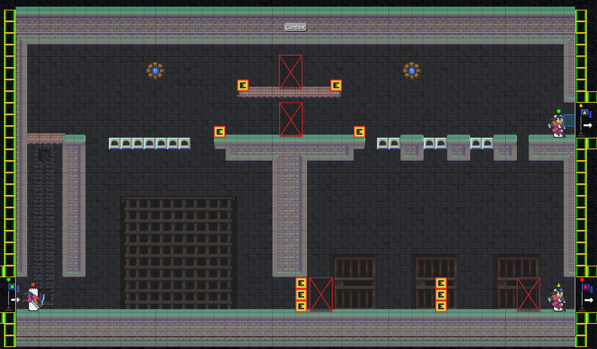
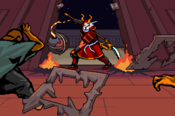
As an example of something that didn’t work, here’s a screenshot of a “tower” level I tried out early on.
An early, unsuccessful attempt at a tower-shaped obstacle course
These kinds of tower obstacle courses lack a sense of structure due to the inconsistent layering of puzzles, obstacles, and floors. It feels like you’re moving around on floating debris rather than climbing interesting architecture or performing perilous feats of acrobatics. Adding enemies just makes it feel more annoying, as you can easily be knocked down several floors through all the gaps and have to make your way up through floors you’ve already cleared.
This should give you an idea of what we actually struggled with early on. Without any rules to dictate how space should be structured, we were mostly plopping obstacles and flooring into maps semi-arbitrarily – throwing things at a board and seeing what sticks. We realized at a certain point that our biggest obstacle was the camera.
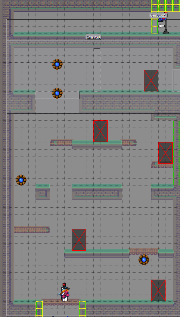
A large room with both horizontal and vertical scrolling
While the early builds of the game had some decent enough platform-snapping and other helpful aids, arbitrary-sized rooms were a struggle. This happens in a lot of Sega Genesis games – big areas with islands the player can occupy, with no way of seeing what’s beneath you or what’s above you. Bubsy and Chakan: The Forever Man were both infamous for this. While we never built levels on the same scale as those games, we still struggled with the visibility issue. At a macro level, we had concerns about the player potentially dropping to their death, not able to tell if they were looking at a pit or someplace they could drop to a lower level. At a micro level, there were frequent annoyances with the camera not quite looking at places that were convenient. It just felt subtly off sometimes if it tracked too high or too low on the screen and cut off things the player wanted to see.
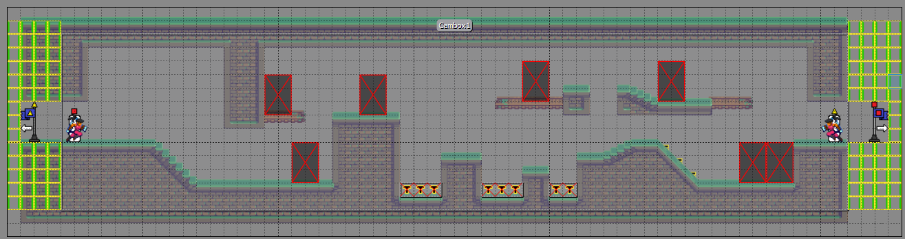
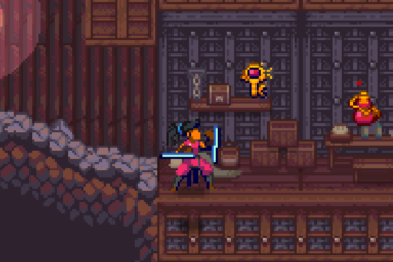
A long room with light combat and platforming elements mixed together – horizontal scrolling only
Our first solution was to bind the camera using “camboxes,” objects that dictated the exact bounds that the camera could move in. We could transition between different camboxes, but a rule we decided to try playing with was making sure that any given room was either all horizontal or all vertical scrolling. Either your room was one screen tall and you principally moved left and right, or it was one screen wide and you could climb up and down. You’ll find that a lot of successful early platformers stick to that rule like glue. Constraining Kenzo to that kind of limitation was… challenging, though, for two reasons. First, Kenzo’s mobility is a huge part of this game, and we were necessarily putting a car boot on it. Second, there was an unsatisfying sense of artificiality that made the whole world feel rigid and flat. So, almost as soon as we adopted these camera rules, I started working on trying to break them.
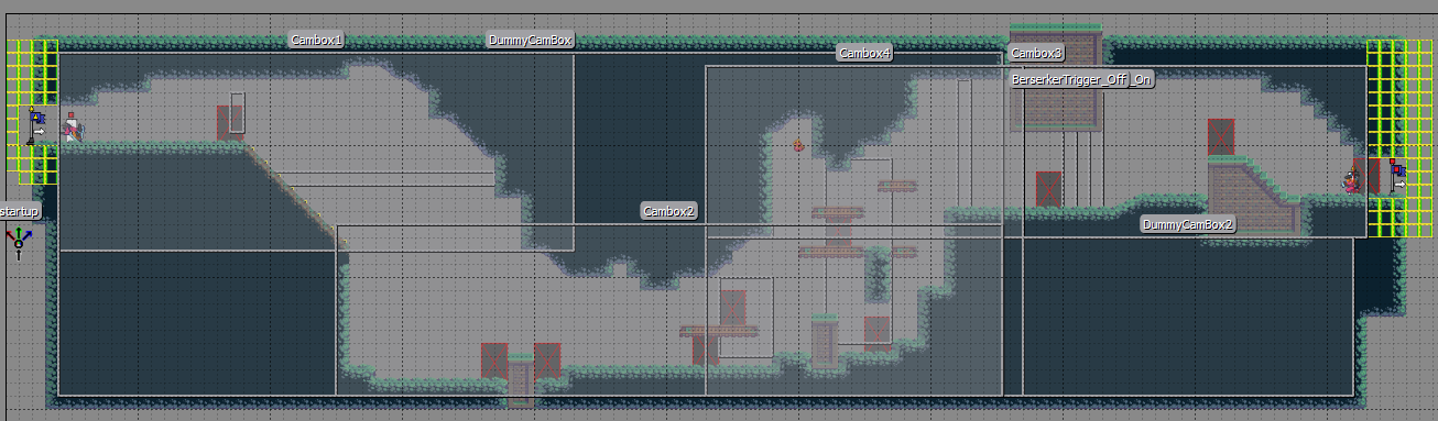
This room featues horizontal-only and vertical-only camera sections, connected by blending transitions.
This “cavern” level was an attempt to blend different camera types. Basically, at different key points in a level it would swap between horizontal and vertical camboxes to fit different parts of the geometry and give the player the best possible view for what they needed to do.
This had mixed success. On one hand, when we got this to work, it injected a lot of variety into our spaces and made them feel more organic without sacrificing a sense of structure. On the other hand, setting up our trigger boxes for transitions between cameras was painful and finicky if we wanted them to be seamless. That goes especially for the player going backward through environments, which could add a whole layer of unpredictability when dropping downward through vertical space.
Camera trails guide the camera through the level as it tracks its target
To help remediate these woes, we developed a “camera trail” system that could lock the camera to a spline. In other words, as the player moves through the screen, the camera travels to the point on the spline based on the player’s position. Later, he refined it to provide a “top” and “bottom” spline that could define upper and lower bounds for the camera based on the player’s position. While this didn’t completely eliminate the need to be fiddly with cambox transitions, it gave us the ability to create sloping or stair-stepped levels without having to repeatedly trade up from one cambox to another, and that alleviated a lot of the stress on this system. Everything else was a matter of committing to certain rules of thumb about when to cut off one room and start a new one, and how to “layer” things in more vertical levels.
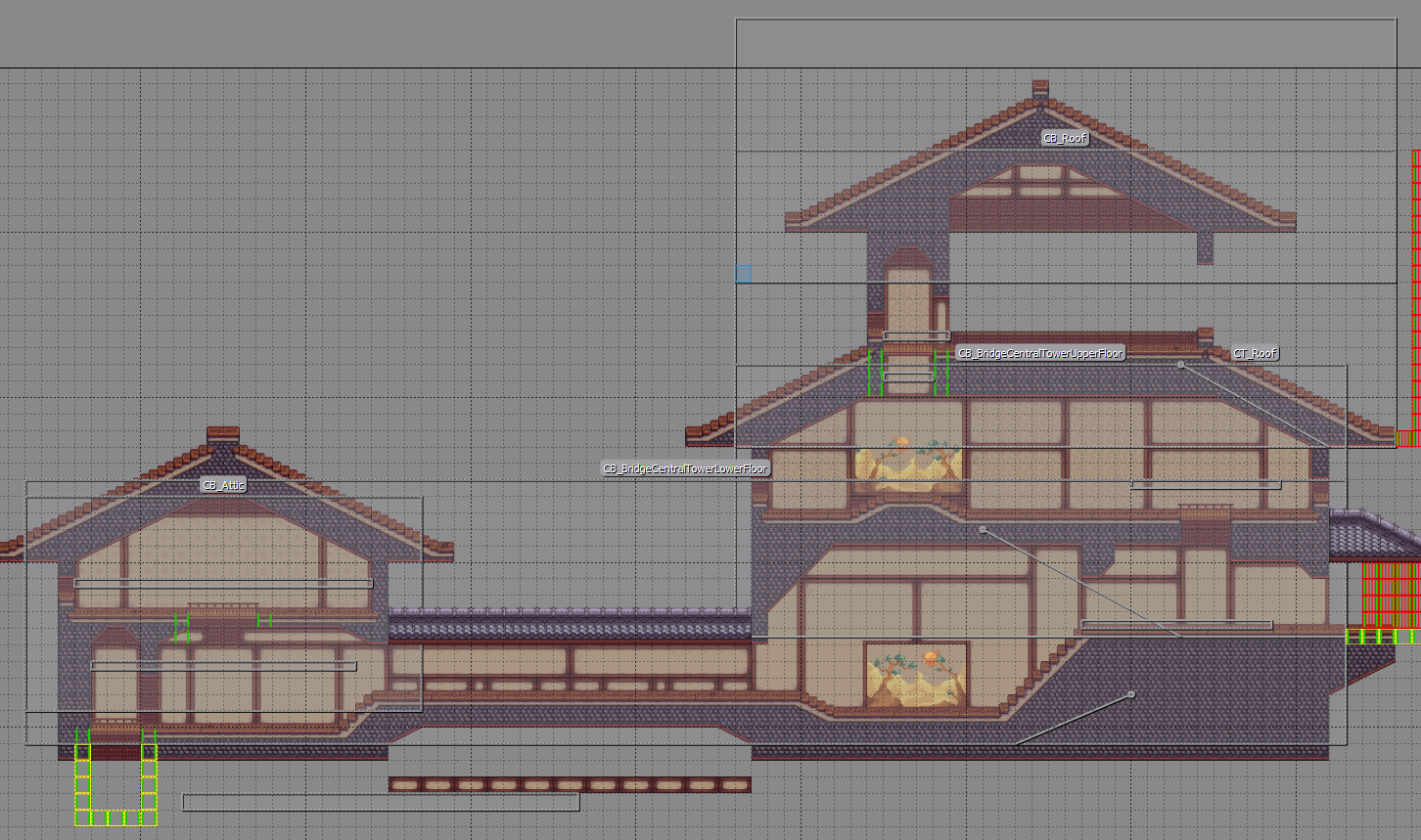
A more successful tower level, with camera trails and transitions working together to track the player throughout the area
What ended up working best was treating levels like an “ant farm” view of something more like a real building, with discrete “floors” that each met a minimum height. This created a superior sense of structure, even when revisiting the previously mentioned “tower” concept. When we apply this alongside the camera refinements, we get the town streets in the demo, with roofs being defined at specific heights, and sloping or broken streets alongside flat ones.
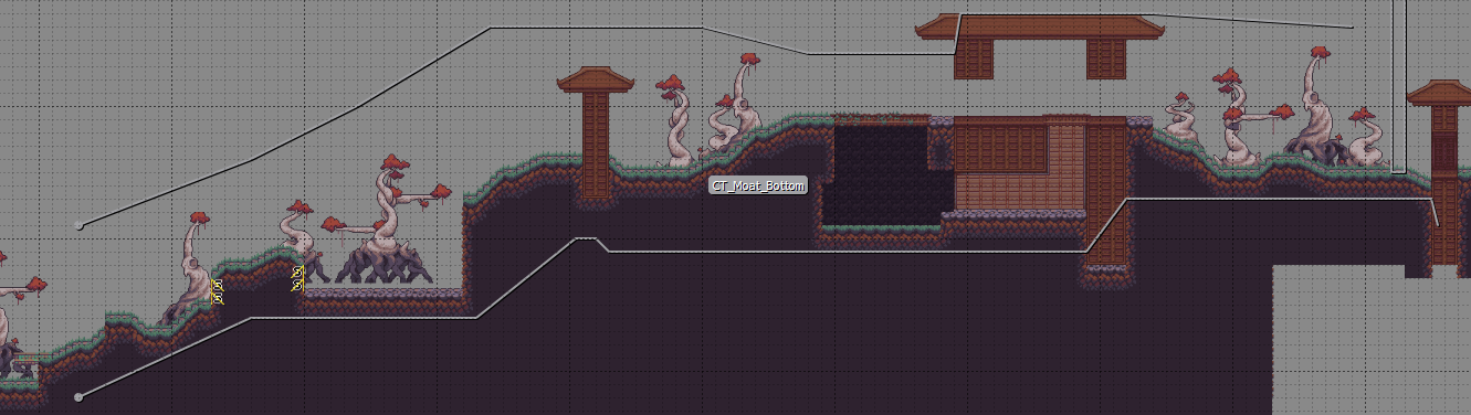
The “Streets of Fire” area combines transitions and trails to follow the player along an ascent of variable steepness while keeping the action cleanly in frame
All these ideas add up to create a satisfying sense of both structure and flow. While the majority of the level is horizontal, the vertical space doesn’t feel wasted. We have enough leeway to ensure different rooms aren’t too repetitive, we can create challenges that come from a variety of different directions, and we can tell a story by having a level slope gradually up a mountain. Most importantly, though, Kenzo can make the most of his movement mechanics by bouncing between different elevations.
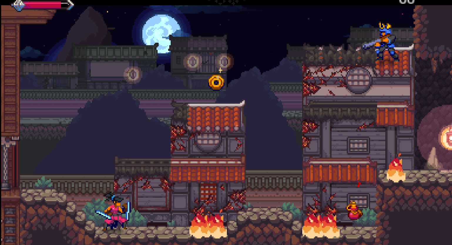
At this point the demo level gives us an idea of what a comfortable (if basic/linear) level for Demon Crush looks like. Some combat pacing may need tweaking, as I think we’re pretty dense with enemies right now, but otherwise I think we’ve arrived at how we want to structure space and what it should feel like to move through it. For our future levels, our goals will be injecting some exploration potential into the level design, and to create unique themes that give each area a sense of focus in both the challenge and aesthetic. These are topics I’m excited to talk about, but I’ll touch on those another time!
0 Comments